Table of contents
Summer colors are having a major moment in 2025, but there's more to them than just bright, sunny hues. Whether you're discovering your personal color palette or choosing colors for your next design project, understanding summer color theory can transform how you approach color selection.
What Are Summer Colors?
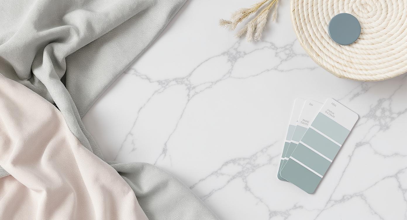
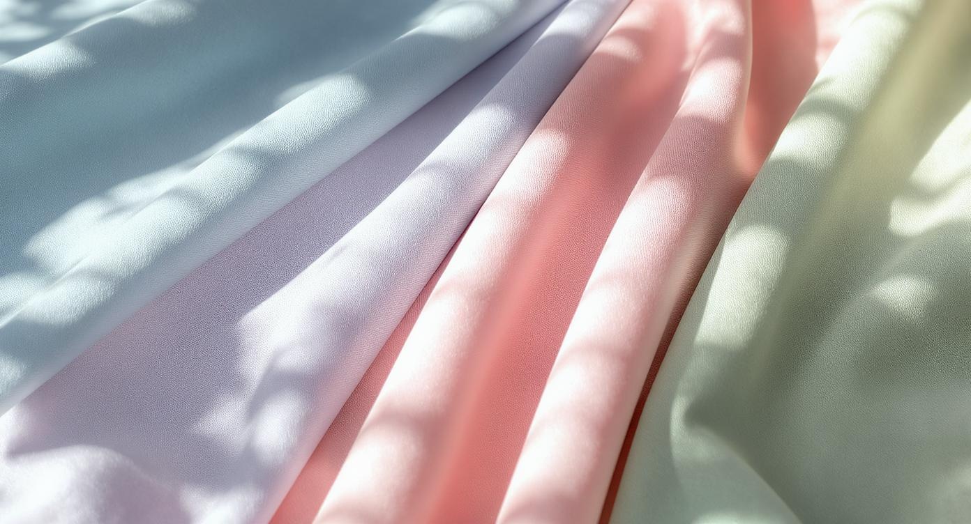
Summer colors embody two key characteristics: coolness and softness. Unlike the warm, vibrant colors of spring or autumn, summer palettes lean toward blue undertones and muted intensities. Think of the colors you see after a gentle summer rain – soft, refreshing, and effortlessly elegant.
The Science Behind Summer Color Theory
Summer color palettes are built on three core principles:
- Cool undertones: Colors contain more blue than yellow
- Muted saturation: Gentle, grayed-out tones rather than bright, vibrant ones
- Medium contrast: Balanced light and dark values without harsh extremes
These characteristics create harmonious color combinations that feel naturally balanced and sophisticated.
The Four Types of Summer Color Palettes
1. True Summer: The Classic Cool Palette
True Summer represents the purest expression of summer colors. These palettes feature:
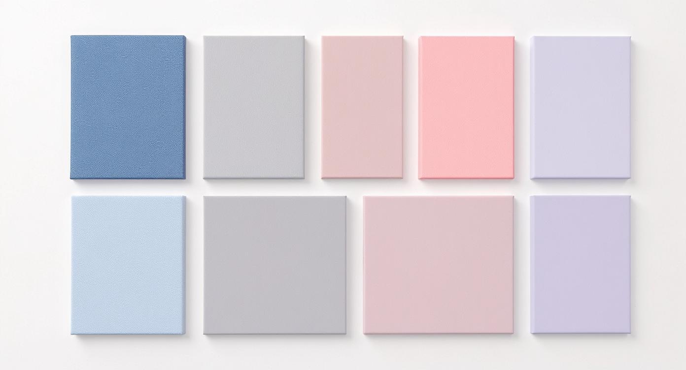
- Best colors: Denim blues, rose pinks, soft grays, lavender purples
- Key characteristics: Equal balance of cool and muted qualities
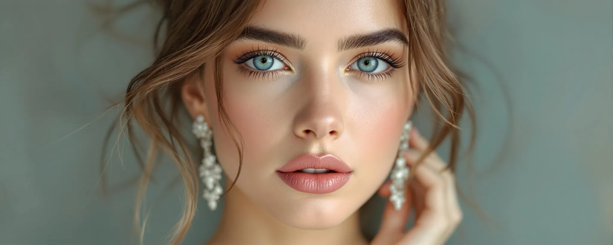
- Perfect for: Those with ashy hair, blue or gray eyes, and cool-toned skin
As explained by The Concept Wardrobe, True Summer is "like a dive into cold water - gentle, calming and refreshing."
2. Light Summer: Delicate and Ethereal
Light Summer palettes are characterized by their ethereal quality:
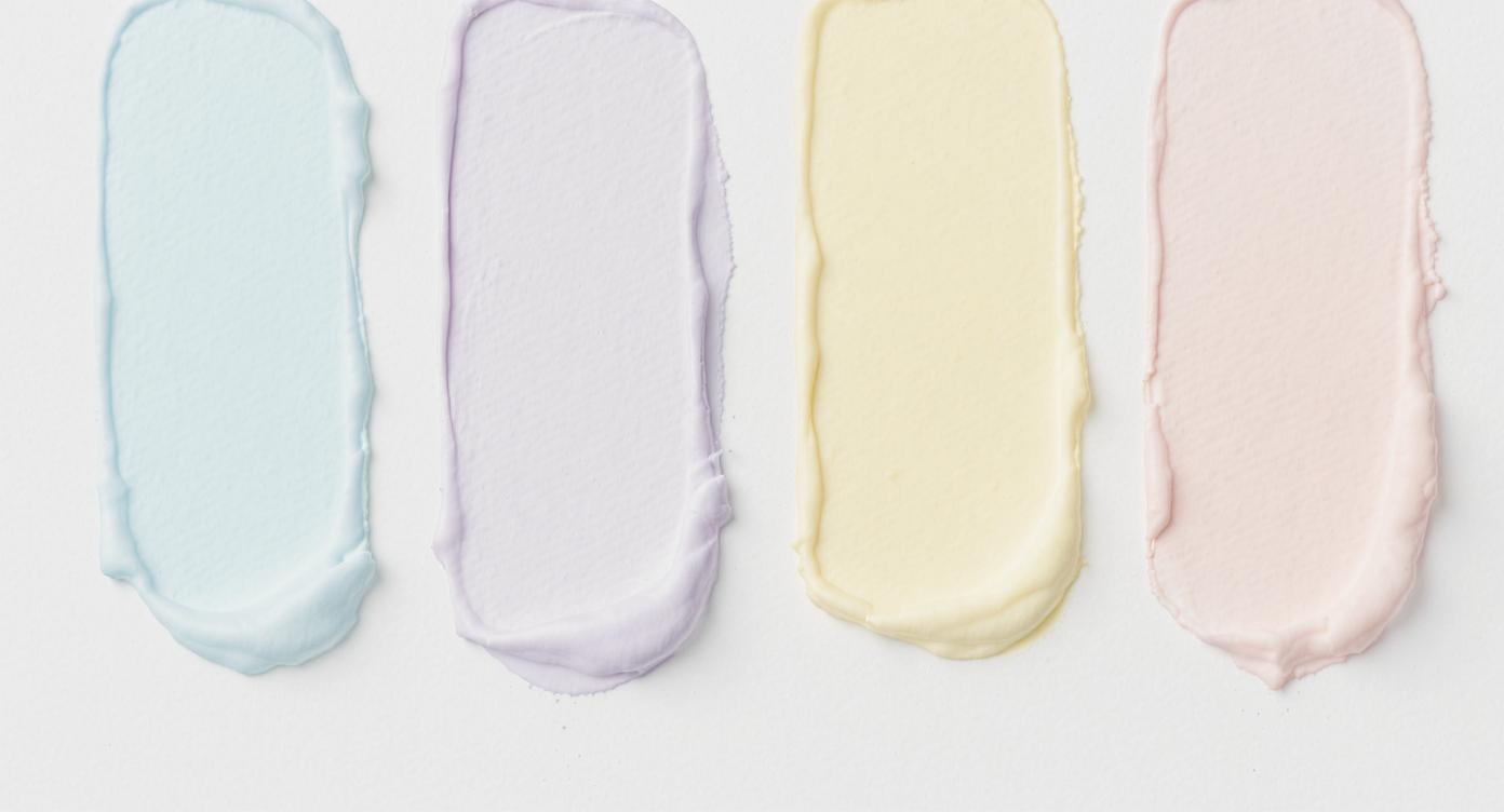
- Best colors: Sky blues, pale yellows, light aquas, powder pinks
- Key characteristics: Lightness dominates over coolness
- Perfect for: Fair complexions with light hair and eye colors
3. Soft Summer: Muted Sophistication
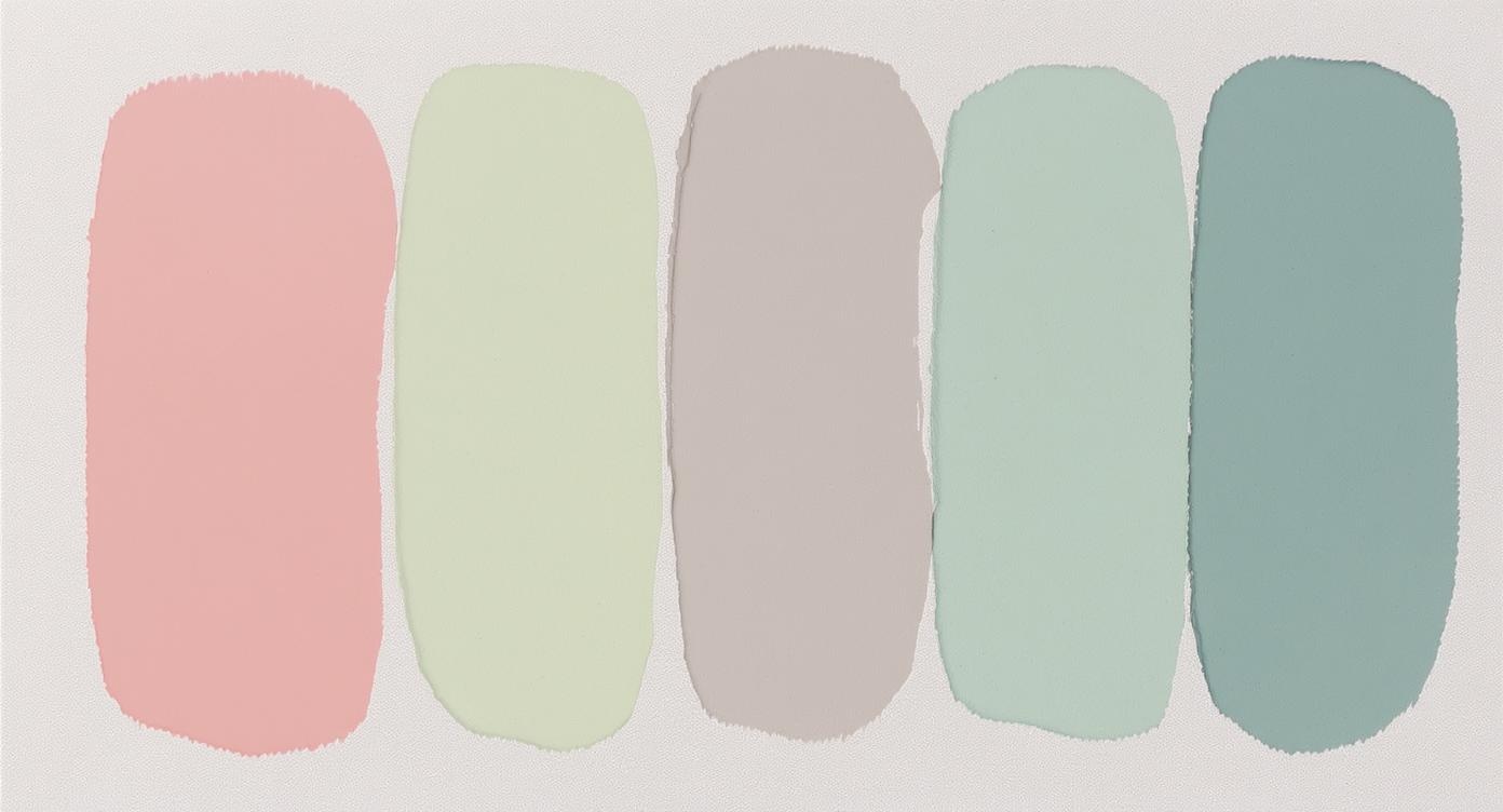
Soft Summer bridges the gap between Summer and Autumn:
- Best colors: Dusty roses, sage greens, soft browns, muted teals
- Key characteristics: Maximum softness with hints of warmth
- Perfect for: Those with hazel eyes and slightly warmer undertones
4. Deep Summer: Rich and Sophisticated
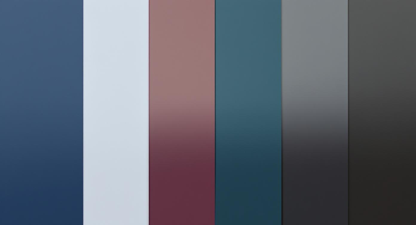
Deep Summer offers the most dramatic summer palette:
- Best colors: Navy blues, burgundy, deep teals, soft blacks
- Key characteristics: Depth and richness while maintaining coolness
- Perfect for: Darker hair and eyes with cool undertones
Summer Colors in Design and Branding
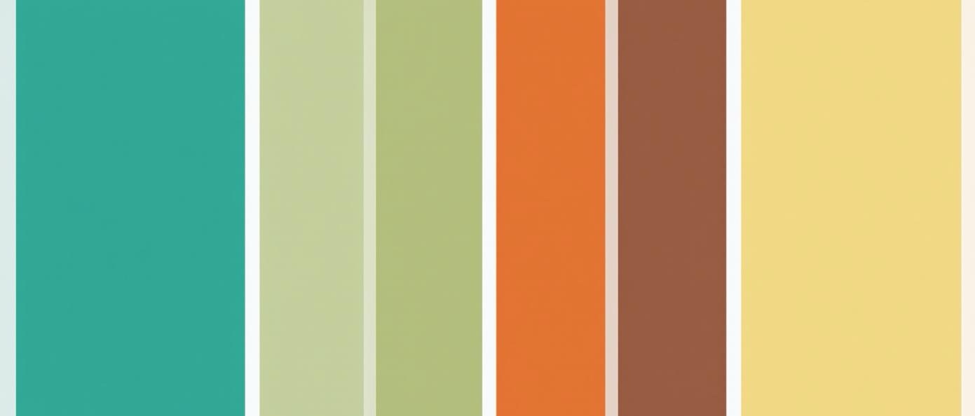
2024 Summer Design Trends
According to Depositphotos, summer 2024 design trends feature four key colors:
- Sand Castle (Greige): A timeless blend of gray and beige
- Summer Rain: Cool blues that evoke refreshing storms
- Fire Flame: Energetic oranges and corals
- Pearlescence: Delicate light pink tones
These colors reflect a shift toward "more grounded, timeless color choices" compared to previous years' neon trends.
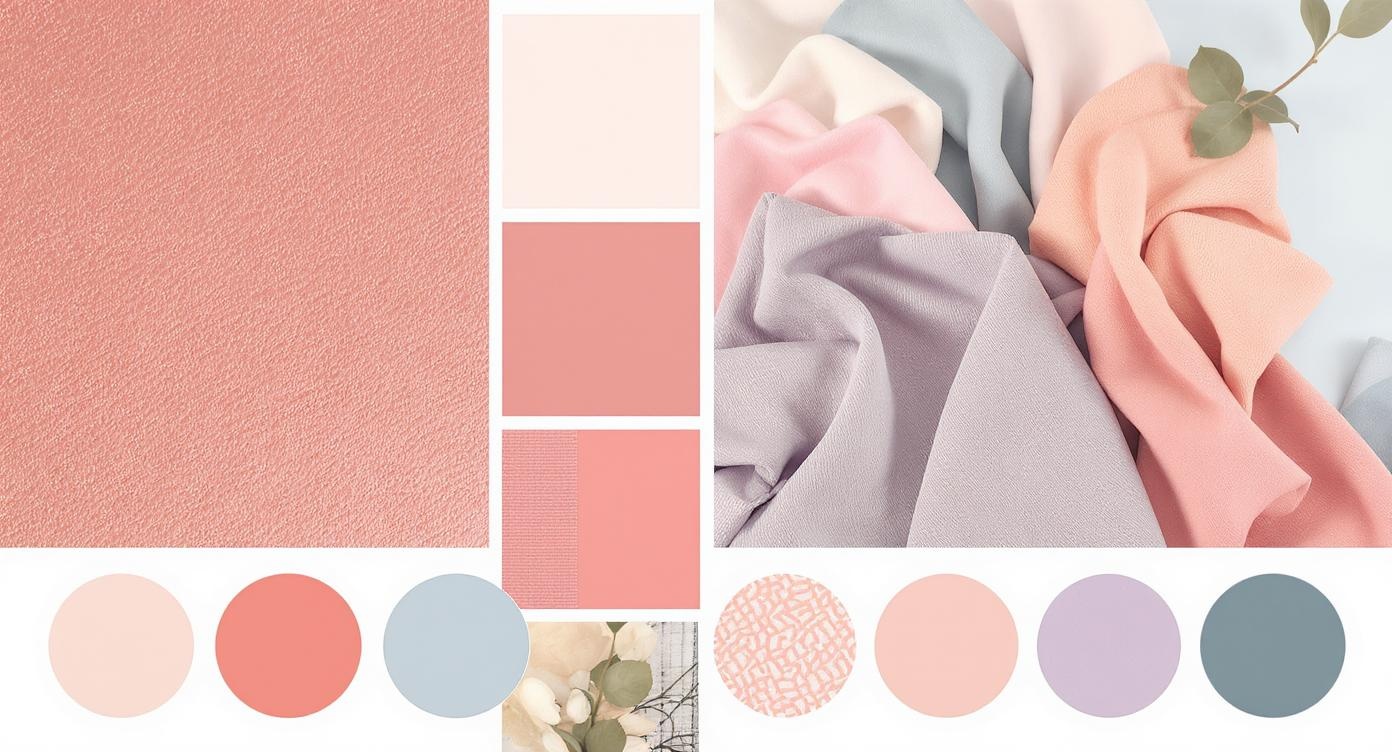
Best Summer Color Combinations for Design
For Tropical Vibes:
- Coral (#FF6B6B) + Turquoise (#4ECDC4) + Cream (#FFF8E1)
- Perfect for travel brands and resort marketing
For Professional Brands:
- Navy (#2C3E50) + Soft Gray (#95A5A6) + Dusty Rose (#D63384)
- Ideal for consulting firms and luxury services
For Creative Projects:
- Lavender (#E6E6FA) + Sage Green (#9CAF88) + Warm White (#FEFEFE)
- Great for wellness brands and artistic portfolios
How to Choose Your Perfect Summer Colors
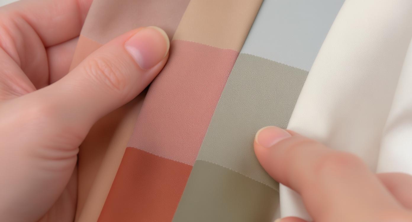
For Personal Styling
- Test with natural light: Hold different colored fabrics near your face in daylight
- Look for harmony: Your best colors will make your skin look healthy and radiant
- Avoid harsh contrasts: Summer types look best in tonal combinations
- Consider your lifestyle: Choose colors that work with your daily activities
For Design Projects
- Define your brand personality: Summer colors work best for calm, sophisticated, or elegant brands
- Consider your audience: Cool tones appeal to different demographics than warm ones
- Test accessibility: Ensure sufficient contrast for readability
- Think seasonally: Summer palettes work year-round but may need seasonal adjustments
Summer Color Psychology
Summer colors evoke specific psychological responses:
- Blues: Trust, calm, professionalism
- Soft Pinks: Nurturing, approachable, feminine
- Muted Greens: Balance, growth, tranquility
- Lavenders: Creativity, luxury, sophistication
- Soft Grays: Stability, timelessness, neutrality
According to Adobe's research, 93% of shoppers prioritize visual appeal when making purchasing decisions, making color choice crucial for business success.
Common Summer Color Mistakes to Avoid
Personal Styling Mistakes
- Using pure black instead of charcoal or navy
- Choosing overly bright or neon colors
- Mixing too many contrasting colors in one outfit
- Ignoring your undertones when selecting colors
Design Mistakes
- Using summer colors for high-energy sports brands (consider autumn instead)
- Combining too many pastels without grounding elements
- Ignoring cultural color associations in global markets
- Forgetting to test colors across different devices and lighting
Seasonal Color Trends: What's Hot for Summer 2024
Based on fashion week trends and design forecasts, these summer colors are dominating 2024:
Fashion Trends:
- Peach Fuzz (Pantone's Color of the Year)
- Soft lilacs and lavenders
- Muted coral tones
- Powder blues
Design Trends:
- Brat Green influence (though softened)
- Sophisticated neutrals
- Ocean-inspired blues
- Sustainable earth tones
Practical Applications
Building a Summer Wardrobe
Essential Colors (choose 3-4):
- One neutral (navy, soft gray, or cream)
- One soft color (dusty rose, lavender, or sage)
- One deeper accent (burgundy, teal, or plum)
- One light color (powder blue, pale pink, or light gray)
Creating Summer Brand Palettes
Service-Based Businesses:
- Primary: Deep teal or navy
- Secondary: Soft gray or cream
- Accent: Dusty rose or sage green
Creative Industries:
- Primary: Lavender or soft purple
- Secondary: Warm gray
- Accent: Coral or peach
Wellness Brands:
- Primary: Sage green or soft blue
- Secondary: Cream or light gray
- Accent: Dusty pink or lavender
Resources
For more information about your personal seasonal color analysis, visit:
Related seasonal color guides
- Spring Family:
- Summer Family:
- Autumn Family:
- Winter Family:
Tools and Resources
For accurate color selection:
- Digital tools: Adobe Color, Coolors.co, Canva's color palette generator
- Physical tools: Color swatches, daylight lamps for testing
- Professional services: Color analysis consultations, brand design services
Remember that color perception can vary significantly across devices and lighting conditions, so always test your chosen colors in their intended context.
Summer colors offer a sophisticated approach to both personal styling and design work. By understanding the principles of coolness, mutedness, and harmony, you can create color combinations that feel both timeless and contemporary. Whether you're updating your wardrobe or refreshing your brand, summer color palettes provide the perfect foundation for elegant, approachable design.

Article by
Natalie Bolonina
Graduated from the ESSEC Business School, Natalie is a marketing expert specializing in beauty tech.
Related Articles
Spring Colors: Your Complete Guide to Personal Color Analysis and 2025 Trends
Discover spring colors for both personal color analysis and 2025 fashion trends. Learn if you're a Spring color type, explore the latest trending hues from powder pink to butter yellow, and master the art of wearing spring's most flattering shades.
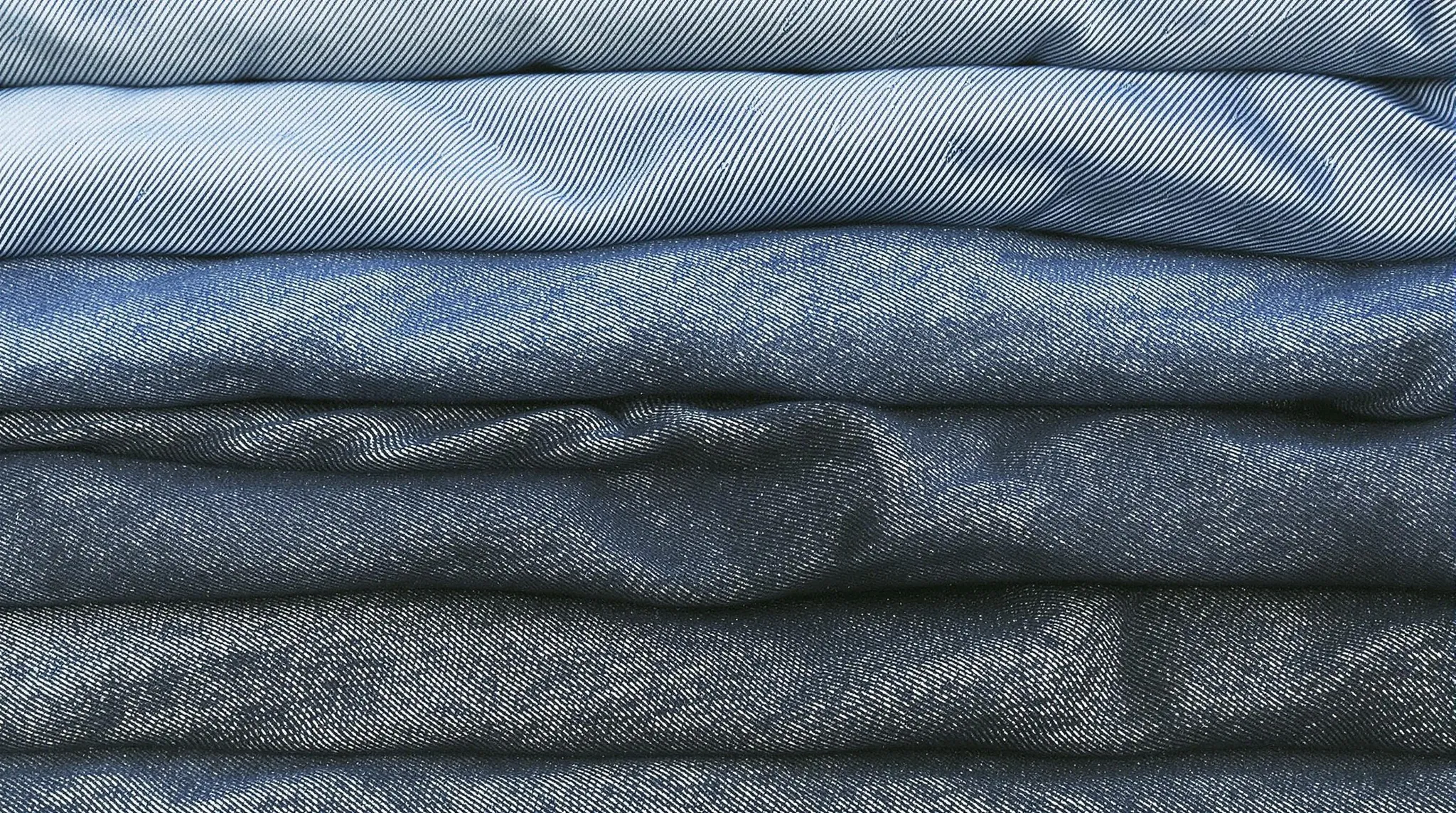
Denim Color: A Comprehensive Guide to the Iconic Blue Hue in 2025
Discover everything about denim color, from its rich history to modern applications in fashion, interior design, and digital media. Learn about different denim shades, color codes, and trending combinations.

Bright Winter Color Palette: The Ultimate Guide to Vivid Cool-Toned Colors (2025)
Discover the striking world of the Bright Winter color palette. Learn how to identify your season, master color combinations, and create a stunning wardrobe that enhances your natural coloring.

Bright Spring Color Palette: A Complete Guide to Vibrant Seasonal Colors (2025)
Discover the vivid world of the Bright Spring color palette. Learn how to identify, wear, and combine these energetic colors to enhance your natural coloring and create a harmonious wardrobe.
Light Summer Color Palette: The Ultimate Guide to Soft, Cool-Toned Colors (2025)
Discover the ethereal world of Light Summer colors. Learn how to identify your season, master color combinations, and create a wardrobe that enhances your light, cool coloring with our comprehensive guide.
Natural Blonde Hair Color: The Ultimate Guide to Achieving a Timeless Look in 2025
Discover everything you need to know about natural blonde hair color, from choosing the perfect shade to maintenance tips and trending styles for 2025.